if(!require("readxl")) install.packages("readxl")
if(!require("tictoc")) install.packages("tictoc")
if(!require("tidyverse")) install.packages("tidyverse")
if(!require("sf")) install.packages("sf", dependencies = TRUE)
if(!require("leaflet")) install.packages("leaflet")
if(!require("leafgl")) install.packages("leafgl")
library(sf)
library(leaflet)
library(leafgl)
library(readxl)
library(tictoc)10 Visualizing Korean Death Rate Data
This tutorial will guide you through visualizing Korean death rate data using R. We’ll cover downloading the data, processing it, and creating interactive maps using leaflet.
- Prerequisites
Before we start, make sure you have the following R packages installed:
10.1 download Korea Death Rate Data
- You can download Korean Death Rate Data from KOSIS KOSIS download
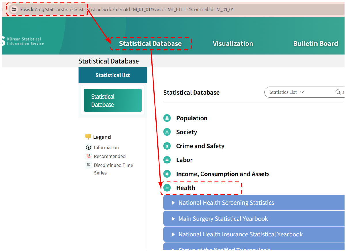
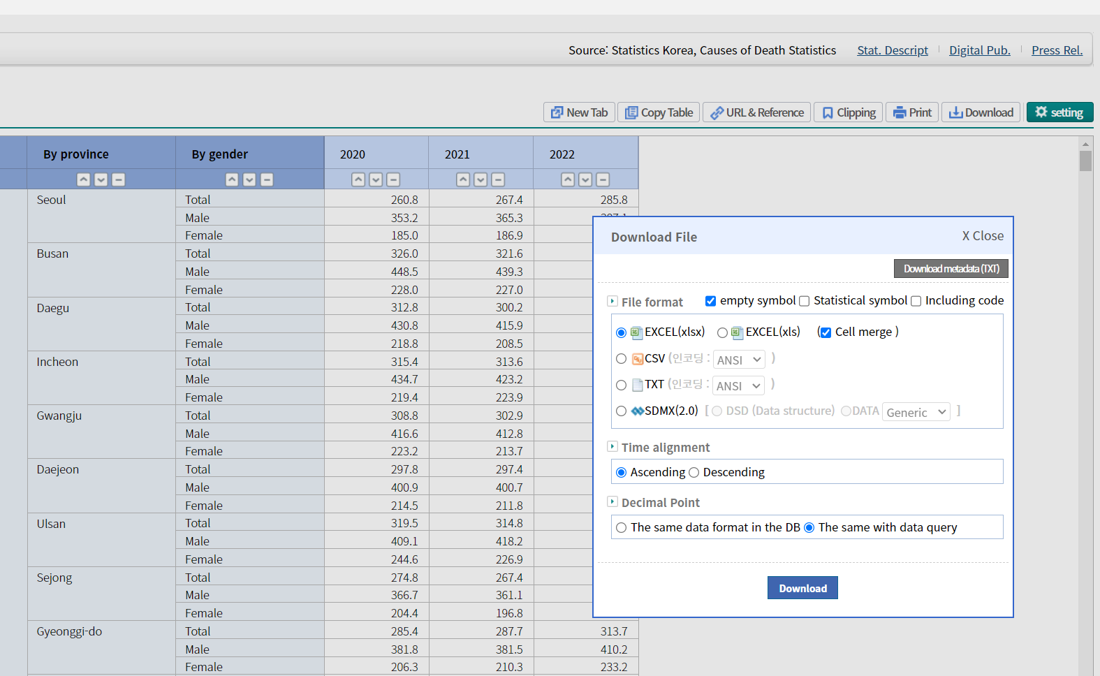
You can choose the death rate by province as an XLSX (Excel) file.
For this tutorial, I’ve uploaded a pre-processed version of the data to GitHub as an RDS (R Data Serialization) file.
kdeath1 <- "https://raw.githubusercontent.com/jinhaslab/opendata/main/data/kdth1.rds"
sf_tr <- "https://raw.githubusercontent.com/jinhaslab/opendata/main/data/sf_tr.rds"
if (!dir.exists("data")) {dir.create("data",  recursive = TRUE)}
download.file(kdeath1, "data/kdth1.rds")
download.file(sf_tr, "data/sf_tr.rds")
This code checks if a “data” directory exists. If not, it creates the directory (and any necessary parent directories) using dir.create(…, recursive = TRUE). It then downloads the RDS files from GitHub and saves them in the “data” directory.
2: Load the Data
Load the downloaded data into R using readRDS.
kdth1 = readRDS("data/kdth1.rds")
sf_tr = readRDS("data/sf_tr.rds")
readRDS is a function that reads a file saved in the RDS format and loads it into R.
- Filter the Data Filter the data to select death rates for a specific cause, year, and gender. In this example, we’ll select the total death rate for both sexes in 2020:
dzchoice = kdth1 %>% pull(cause) %>% unique()
yearchoice= kdth1 %>% pull(year) %>% unique()
sexchoice = c("Total", "Male", "Female")

rate = kdth1 %>%
  filter(cause == dzchoice[1],
         year  == yearchoice[1],
         sex   == sexchoice[1]
         )
explain
- dzchoice = kdth1 %>% pull(cause) %>% unique(): Extracts the unique causes of death from the data.
- yearchoice = kdth1 %>% pull(year) %>% unique(): Extracts the unique years from the data.
- sexchoice = c(“Total”, “Male”, “Female”): Defines the sex choices.
rate = kdth1 %>% filter(…): Filters the data to select the specific cause, year, and sex.
4: Merge Geographic and Mortality Data
We join the geographic data with the mortality data. This will allow us to visualize the death rates on a map.
sf_tr_m = sf_tr %>%
  left_join(rate, by=c("CTP_ENG_NM"="region")) %>%
mutate(rate = as.numeric(rate))- mutate(rate = as.numeric(rate)): Converts the rate column to numeric type for consistency.
5: Create Color and Label Variables
Define color and label variables for the map:
rate_colors =
  colorNumeric(
  palette = "YlOrRd",
  domain = sf_tr_m$rate
  )
label_text = sprintf("Region: %s, <br> Rate: %s",
                     sf_tr_m$CTP_ENG_NM, sf_tr_m$rate
                     )
YlOrRd Color Palette
- “YlOrRd” stands for Yellow-Orange-Red. It is one of the sequential color palettes available in the RColorBrewer package, which is designed for creating visually appealing and informative color schemes for maps and other graphics. Sequential palettes are useful for data that progresses from low to high values.
How It Works in colorNumeric
- palette = “YlOrRd”: This specifies that the Yellow-Orange-Red palette should be used for the color scale.
domain = sf_tr_m$rate: This defines the range of values (the domain) for which the color scale should be created.sf_tr_m$rateis the vector of death rates, and thecolorNumericfunction will map these values to colors in the “YlOrRd” palette.
6: Set Map Center
Set the latitude and longitude for centering the map on Korea:
korea_lat = 36 ; korea_lng = 1287: Create the Map
Create an interactive map displaying the mortality rate:
leaflet(data = sf_tr_m) %>%
  addProviderTiles("CartoDB.Positron") %>%  # Adds a light-themed base map from CartoDB
  setView(lng = korea_lng, lat = korea_lat, zoom = 6.4) %>%
  addPolygons(
    fillColor = ~rate_colors(rate),
    color = "#444444",   # Border color of the polygons
    weight = 1,          # Border width
    opacity = 1,
    fillOpacity = 0.7,   # Fill opacity of the polygons
    smoothFactor = 0.5,
    highlightOptions = highlightOptions(
      color = "white",
      weight = 2,
      bringToFront = TRUE
    ),
    label =  lapply(label_text, htmltools::HTML)
  ) %>%
  addLegend(
    pal = rate_colors,
    values = sf_tr_m$rate
  )
10.2 Create a Function for Visualization
Function Definition: Combine the steps into a function for easier reuse.
mapf = function(dzchoice, yearchoice, sexchoice){
  rate = kdth1 %>%
    filter(cause == dzchoice,
           year  == yearchoice,
           sex   == sexchoice
    )
  sf_tr_m = sf_tr %>%
    left_join(rate, by=c("CTP_ENG_NM"="region")) %>%
    mutate(rate = as.numeric(rate))

  rate_colors =
    colorNumeric(
      palette = "YlOrRd",
      domain = sf_tr_m$rate
    )
  label_text = sprintf("Region: %s, <br> Rate: %s",
                       sf_tr_m$CTP_ENG_NM, sf_tr_m$rate
  )

  korea_lat = 36 ; korea_lng = 128

  leaflet(data = sf_tr_m) %>%
    addProviderTiles("CartoDB.Positron") %>%  # Adds a light-themed base map from CartoDB
    setView(lng = korea_lng, lat = korea_lat, zoom = 7) %>%
    addPolygons(
      fillColor = ~rate_colors(rate),
      color = "#444444",   # Border color of the polygons
      weight = 1,          # Border width
      opacity = 1,
      fillOpacity = 0.7,   # Fill opacity of the polygons
      smoothFactor = 0.5,
      highlightOptions = highlightOptions(
        color = "white",
        weight = 2,
        bringToFront = TRUE
      ),
      label =  lapply(label_text, htmltools::HTML)
    ) %>%
    addLegend(
      pal = rate_colors,
      values = sf_tr_m$rate
    )
}
10.3 Create a Shiny App for Interactive Visualization
Now we can create a Shiny app to allow interactive visualization of the data: