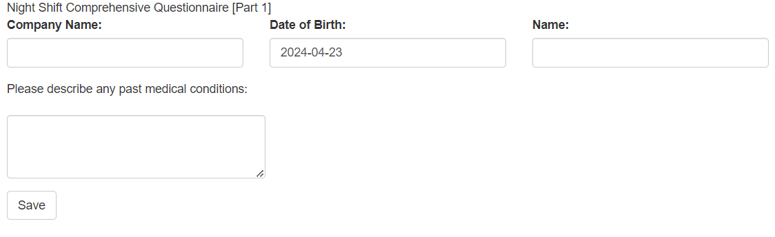
ui <- fluidPage(

  # Page Title
  "Night Shift Comprehensive Questionnaire [Part 1]",

  # Basic Input Fields
  fluidRow(
    column(4, textInput("compname", "Company Name: ", "")),
    column(4, dateInput("birthyear", "Date of Birth: ")),
    column(4, textInput("name", "Name: ", ""))
  ),

  # Main Questionnaire Area
  "Please describe any past medical conditions:",
  textAreaInput("past_history", "", rows = 3),

  # Submit Button
  actionButton("save1", "Save")
)8 Shiny and HTML and javascript
8.1 Why we use HTM and JavaScript into Shiny apps
Integrating HTML and JavaScript into Shiny apps is important for several key reasons:
1. Enhanced Customization
Fine-Grained Control: While Shiny provides a solid set of UI components, HTML gives you absolute control over the structure and arrangement of elements. You can build layouts and components precisely as you envision them.
Unique Styling: CSS allows you to style every aspect of your app’s appearance. Go beyond Shiny’s default styling to establish a distinct visual identity that matches your branding or needs.
Advanced Visuals: Integrate external JavaScript charting libraries (D3.js, Plotly.js, Leaflet, etc.) to create highly interactive and customizable visualizations that go beyond what Shiny offers out of the box.
2. Unlocking Interactivity
Dynamic Behavior: JavaScript empowers you to modify the UI directly in response to user actions. Create elements that appear/disappear, animations, and seamless user experiences without full page refreshes. Complex Input Handling: Use JavaScript for custom input validation that goes beyond Shiny’s basic checks (e.g., real-time field validation, complex form logic).
External Library Integration: Tap into the vast world of JavaScript libraries for specialized UI widgets, interactive elements, and functionality that extends Shiny’s capabilities.
3. Bridging the Gap
Leveraging Web Development Skills: If you or your team have HTML, CSS, and JavaScript expertise, you can directly apply these skills within your Shiny apps.
Reusing Existing Components: Integrate pre-existing HTML templates or JavaScript components you might already have, saving development time. Example Scenarios
Custom Dashboard: Build a highly tailored dashboard interface with a specific grid layout, custom styling, and interactive visualizations using a charting library.
Responsive Layouts: Design Shiny apps that adapt seamlessly to different screen sizes, a feature that can be more easily achieved using HTML/CSS techniques.
Interactive Map: Embed a map from Leaflet allowing users to zoom, pan, and interact with data markers in ways not directly supported by standard Shiny components.
4. Let’s be mindful:
Trade-off: Too much reliance on raw HTML/JS can increase code complexity and potentially add to maintenance overhead. It’s best to use it strategically where Shiny’s built-in features don’t fully meet your needs.
ShinyJS: The shinyjs package in R provides useful functions to make standard JavaScript interactions easier within the Shiny framework.
8.2 How to use html tags, custom css and js
Here is basic shiny app structure,
8.2.2 Tutorial of HTML code anc CSS in shiny
This code demonstrates the integration of HTML tags, raw HTML, and CSS styling to create the basic structure of a Shiny web application.
ui <- fluidPage(
  tags$head(
    tags$style(
      "
      .h3-center {
      text-align: center;
      font-weight: bold;
      }
    ")
  ),
  # Page Title
  tags$h3("Night Shift Comprehensive Questionnaire [Part 1]", class="h3-center"),
  tags$h3("Night Shift Comprehensive Questionnaire [Part 1]"),
  h3("Night Shift Comprehensive Questionnaire [Part 1]", style="text-align: center;font-weight: bold;"),
  HTML('<h3>Night Shift Comprehensive Questionnaire [Part 1]</h3>'),
  # Basic Input Fields
  fluidRow(
    column(4, textInput("compname", "Company Name: ", "")),
    column(4, dateInput("birthyear", "Date of Birth: ")),
    column(4, textInput("name", "Name: ", ""))
  ),

  # Main Questionnaire Area
  HTML("Please describe any past  medical conditions:"),
  textAreaInput("past_history", "", rows = 3),

  # Submit Button
  actionButton("save1", "Save")
)- CSS Styling
tags$head: This section is dedicated to elements that go into theof your HTML document.
tags$style: This function is used to embed CSS styles directly within your Shiny app..h3-centerClass: You’ve defined a CSS class with the following properties:- text-align: center: Centers the text horizontally.
- font-weight: bold : Makes the text bold.
- Page Title Variations
You have several ways of creating the page title “Night Shift Comprehensive Questionnaire [Part 1]”. Let’s look at each:
- tags$h3 with Class:
tags$h3("Night Shift Comprehensive Questionnaire [Part 1]", class="h3-center")This utilizes Shiny’s built-in h3 function and applies the h3-center class to style it.
- h3 with Inline Style:
h3("Night Shift Comprehensive Questionnaire [Part 1]", style="text-align: center;font-weight: bold;") This creates the h3 element directly and sets the styles inline.
- HTML() with
<h3>:
HTML('<h3>Night Shift Comprehensive Questionnaire [Part 1]</h3>') This inserts the raw HTML equivalent of an <h3> tag into the UI.
custom style
Here’s how to define multiple CSS classes within a Shiny app, with examples for customizing headers and form elements.
ui <- fluidPage(
  tags$head(
    tags$style(
      "
      .h3-center {
      text-align: center;
      font-weight: bold;
      }
      .table-like {
      border: 1px solid #ff4d4d; /* Color of your table border */
      background-color: #e6f2ff; /* Light blue background for input fields */
      border-radius: 5px; /* Rounded corners for the 'table' */
      }
    ")
  ),
 # Page Title
 h3("Night Shift Comprehensive Questionnaire [Part 1]", class="h3-center"),
 div(class="table-like",
  # Basic Input Fields
  fluidRow(
    column(4, textInput("compname", "Company Name: ", "")),
    column(4, dateInput("birthyear", "Date of Birth: ")),
    column(4, textInput("name", "Name: ", ""))
  )),

  # Main Questionnaire Area
  HTML("Please describe any past  medical conditions:"),
  textAreaInput("past_history", "", rows = 3),

  # Submit Button
  actionButton("save1", "Save")
)
The class=“table-like” in the provided code is a way to apply a CSS class to a specific HTML element (a div element in this case).
Let’s break it down:
- class Attribute: This is a standard HTML attribute used to assign CSS classes to elements.
- table-like: This is the name you’ve chosen for the CSS class. It identifies a set of styling rules defined elsewhere (within the tags$style section of your UI code).
- div Element: The div element acts as a container. By assigning the class=“table-like” to this div, you’re applying those styles to everything within that container (in this case, the entire row of input fields).
Explanation of the .table-like CSS Class
The actual functionality is defined within the CSS stylesheet (tags$style section) under the class .table-like. Here’s what each property does:
- border: 1px solid #ff4d4d: Creates a solid 1-pixel border around the element with the color #ff4d4d (most likely a shade of red).
- background-color: #e6f2ff: Sets the background color within the element to a light blue shade (#e6f2ff).
- border-radius: 5px: Adds rounded corners to the element with a radius of 5 pixels.
Overall Effect
By applying the table-like class, you’re visually grouping the input fields and giving them a table-like appearance with a border, background color, and rounded corners.
Using Custom style.css file
Instead of embedding CSS directy with ‘tags$style’,
tags$head(
    tags$link(rel="stylesheet", type="text/css", href="styles.css"),
  )
Using tags$link to reference an external CSS file (styles.css in www directory) generally offers several advantages over embedding CSS directly with tags$style:
1). Maintainability
- Separation of Concerns: CSS rules exist within their own .css file, keeping your Shiny UI code focused on structure and less cluttered with styling.
- Easier Editing: Large or complex CSS stylesheets are easier to modify and manage in a dedicated file using suitable text editors or IDEs.
- Reusability: The same styles.css can be linked to multiple Shiny UI files, promoting consistent styling across your applications.
2). Readability
- Cleaner UI Code: Your Shiny UI code (ui.R file) becomes less crowded, making it easier to focus on the overall structure of the application.
- Familiar Syntax: For those comfortable with CSS, working within a .css file is typically more intuitive than having tags$style blocks in your Shiny R code.
3). Performance Considerations
- Caching: Browsers can cache external stylesheets, potentially leading to faster loading times on subsequent visits to your Shiny application.
4). When Inline Styling Might Be Used
- Small Tweaks: If you have very minimal CSS changes (affecting only one or two elements), then tags$style might be suitable for convenience.
- Dynamic Styling: If you need to generate CSS rules based on calculations or user input within Shiny, using tags$style alongside Shiny’s reactivity can be necessary.
5). Best Practice
For most projects, using tags$link to reference external CSS is considered the best practice due to its benefits in maintainability, readability, and structure.
8.3 Using JavaScript in Shiny
Here are ui, server, global files and app.js
ui <- fluidPage(
  tags$head(
    tags$link(href="https://fonts.googleapis.com/css2?family=Gowun+Dodum&display=swap", rel="stylesheet"),
    tags$link(rel="stylesheet", type="text/css", href="styles.css"),
    tags$script(src="app.js")
  ),
 # Page Title
 h3("Night Shift Comprehensive Questionnaire [Part 1]", class="h3-center"),
 div(class="table-like",
  # Basic Input Fields
  fluidRow(
    column(4, textInput("compname", "Company Name: ", "")),
    column(4, dateInput("birthyear", "Date of Birth: ")),
    column(4, textInput("name", "Name: ", ""))
  )),
  # Main Questionnaire Area
 HTML("Please describe any past  medical conditions:"),
 textAreaInput("past_history", "", rows = 3),

 hr(),
 h4(">> Sleep Disorders (Insomnia Index)"),
 h5("1~3. Please indicate how severe the problems in each of the following items have been in the past 2 weeks.", style="font-weight: bold;margin-left:5px;"),
 DT::dataTableOutput('input_table_sleep_1'),
 br(),
  # Submit Button
  actionButton("save1", "Save")
)
for UI,
- Placeholder: The line
DT::dataTableOutput('input_table_sleep_1')acts as a placeholder within your user interface. It signals to Shiny, “Reserve a space here – I’ll dynamically populate it with a data table later.” - Output ID: The ‘input_table_sleep_1’ is a crucial identifier. It allows the Shiny server to target this specific element to insert the generated table content
server= function(input, output, session){
  output$input_table_sleep_1 <- DT::renderDataTable(
    q1m, escape = FALSE, selection = 'none', server = FALSE,
    options = list(dom = 't', paging = FALSE, ordering = FALSE),
    class = 'cell-border stripe'
  )

}
for server
Let’s break down what happens within this renderDataTable section:
- Data Source: You provide q1m as the data that will make up your table’s content. Remember, q1m is the HTML matrix generated by your generate_html function, containing the structure of survey questions and the radio button inputs.
- escape = FALSE: Tells Shiny to render the HTML from q1m directly, so your radio button survey inputs appear correctly.
- selection, paging, ordering: These control table features. You’ve disabled selection, pagination, and ordering for simplicity.
- class: Applies CSS classes for visual styling of your table.
Key Function: The DT::renderDataTable() is the workhorse that takes the HTML structure, combines it with styling options, and transforms it into a proper interactive DataTable to be displayed within the UI placeholder.
library(shinyalert)
library(shiny)
library(DT)
library(shinyWidgets)
library(tidyverse)

# Question codes
q1_code <- c("slp_q1", "slp_q2", "slp_q3")
q1_source <- c("1. Difficulty falling asleep", "2. Difficulty staying asleep", "3. Waking up too early")

# Answer option codes
opt1_code <- c("opt1_1", "opt1_2", "opt1_3", "opt1_4", "opt1_5")
opt1_source <- c("None", "Slightly", "Moderately", "Severely", "Very<br>Severely")
opt1_value <- c(0, 1, 2, 3, 4)


generate_html <- function(q_code, q_source, opt_value, opt_source) {
  html_matrix <- sapply(q_code, function(code) {
    sapply(opt_value, function(value) {
      sprintf('<input type="radio" class="my-radio-button" id="%s-%d" name="%s" value="%d"/>',
              code, value, code, value)
    }, USE.NAMES = FALSE)
  }, USE.NAMES = FALSE)
  html_matrix <- matrix(unlist(html_matrix), nrow = length(q_code), byrow = TRUE)
  rownames(html_matrix) <- q_source
  colnames(html_matrix) <- opt_source
  return(html_matrix)
}

# Use the function to generate your HTML matrix
q1m <- generate_html(q1_code,q1_source,opt1_value,opt1_source)
Let’s break down the code step-by-step to understand its purpose in generating a survey questionnaire.
generate_html Function
Purpose: The core of the code. It dynamically creates the HTML structure required for radio-button style survey questions.
Logic:
- It takes the provided question and option data as input.
- Uses nested sapply loops to iterate through questions and answer options.
- The sprintf function carefully formats HTML strings for each radio button, embedding codes, names, and values for later use in Shiny.
- It organizes the generated HTML into a matrix for convenient structure, with rows representing questions and columns representing answer choices.
Generating Input Matrix
q1m <- generate_html(...): Here, the generate_html function is called with the survey data. The resulting HTML matrix is stored in the q1m variable.
How It Works in Shiny
While this code snippet doesn’t represent a complete Shiny app, here’s how it likely fits into the bigger picture:
- UI Definition: In your Shiny UI, you’d use functions like htmlOutput() or potentially DT::datatable() to insert the contents of the q1m variable into your app’s layout, rendering the survey questions.
- Server Logic: The Shiny server would handle user selections from the radio buttons. This would involve accessing the values of the selected inputs, which can then be processed, stored, or used to trigger other actions in your app.
// app.js
$(document).ready(function() {
  console.log("Document ready and script loaded."); // Debug log

  $(document).on('change', '.my-radio-button', function() {
    var name = $(this).attr('name');
    var value = $(this).val();
    console.log("Radio button changed:", name, value); // Debug log
    Shiny.setInputValue(name, value);
  });
});
The JavaScript Connection (app.js)
The JavaScript code plays a vital role connecting user actions on the survey radio buttons to Shiny’s reactivity:
$(document).on('change', '.my-radio-button', function() { ... });: This listens for “change” events on any elements with the class my-radio-button (which your radio buttons have).Shiny.setInputValue(name, value);: The key line! It tells Shiny to update an input variable with the name and value of the selected radio button. This triggers Shiny’s reactivity, potentially causing other parts of your app to update.
style.css is following.
.gowun-dodum-regular {
        font-family: 'Gowun Dodum', sans-serif;
        font-weight: 400;
        font-style: normal;
      }

body {
        font-family: 'Gowun Dodum', sans-serif;
}

.h3-center {
  text-align: center;
  font-weight: bold;
}
.input-row {
        padding: 5px 0;
      }
.shiny-input-container {
  padding: 0 5px;
}
.shiny-input-container>label {
  font-weight: bold;
}
.shiny-input-radio>label {
  font-weight: normal;
}

.table-like {
  border: 1px solid #ff4d4d; /* Color of your table border */
  background-color: #e6f2ff; /* Light blue background for input fields */
  border-radius: 5px; /* Rounded corners for the 'table' */
}
.table-header {
  background-color: #ff4d4d; /* Red background for headers */
  color: white; /* Text color for headers */
  text-align: center;
  border-radius: 5px 5px 0 0; /* Rounded corners for header */
  padding: 5px;
  margin-bottom: 0; /* Remove bottom margin from headers */
}
.inline label{
  display: table-cell; text-align: left; vertical-align: middle;
}
.inline .form-group{display: table-row;}


.input-large {
  width: 100%;
  max-width: 100%;
  height: 150px;
}
.form-title {
  background-color: #e9ecef;
  padding: 10px;
  font-weight: bold;
  #border-top: 2px solid #0275d8;
  #border-bottom: 2px solid #0275d8;
  margin-bottom: 20px;
}

.vertical-align-middle {
        display: inline-block;
        vertical-align: middle;
}

.inline-radio-group .shiny-input-radio {
        display: inline-block;
        vertical-align: top;
        margin-right: 5px;
}
.inline-radio-group label {
  display: inline-block;
  margin-right: 20px;
}
.inline-radio-group .form-group {
  margin-bottom: 0;
}
.shiny-input-container {
  clear: both;
  padding-top: 5px;
}

table.dataTable thead th {
  background-color: #e9ecef;
  border: 0.1px solid  #d3d3d3;
}

.custom-row .row {
  margin-bottom: 2px; /* Reduces space between rows */
}


.custom-row .form-group {
  margin-bottom: 2px; /* Reduces bottom margin of form groups, affecting radio buttons */
}

.action-button {
  border: 1px solid #ff4d4d; /* Color of your table border */
  background-color: #e6f2ff; /* Light blue background for input fields */
  border-radius: 5px; /* Rounded corners for the 'table' */
}
You can find full code of ui, server, global here